Bigplace Caps
Creator: Fernando Haro
A static specimen is not available for this archived character mapping.
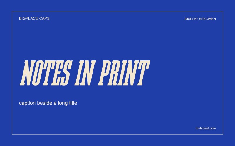
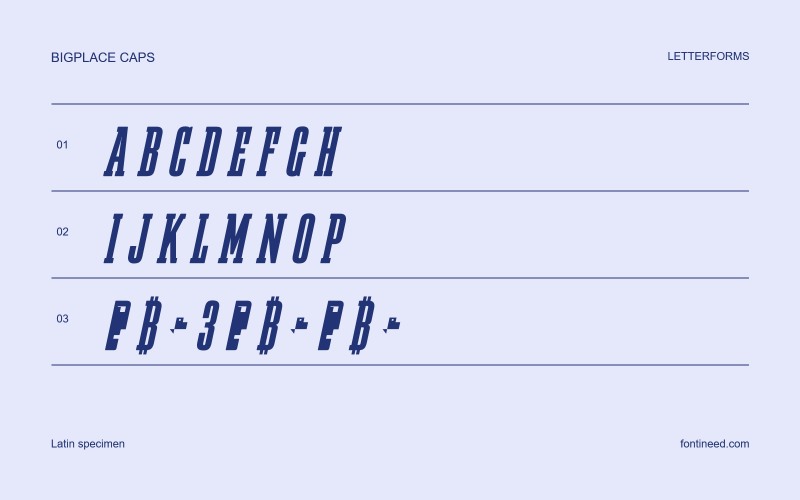
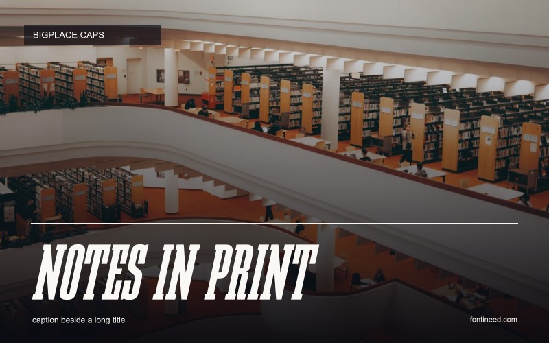
Bigplace Caps in use
Bigplace Caps gets its energy from the combination of height, slant and compression. I’d use it on a sporting poster or a concert date where one row of capitals needs to feel in motion. A diagonal on the letterform can bring momentum to a very plain composition. Look especially at the punctuation and figures in the actual setting. Different amounts of breathing room around those small marks can keep a crowded headline from becoming a single blur.

Open Source / OFL
Befonts license listing. The font file specifies different terms.
View on BefontsSimilar Fonts
Related catalog styles; compare the characters and license before choosing.


More by Fernando Haro
Explore other catalog entries credited to this designer.

Newly Added Fonts
Recently added to the FontIneed catalog.


