Wheaton Capitals
Creator: Ray Larabie

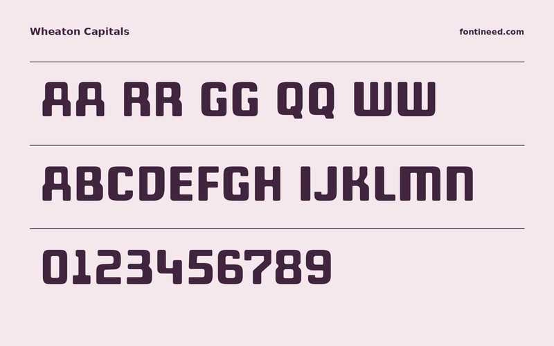

About this font
Wheaton Capitals in use
Wheaton Capitals feels especially good in a short word with both narrow joins and broad curved letters. The heavy strokes are designed to occupy a line with authority. I’d try it on a modest print edition or the name of a workshop. Use a companion for the sentence-length information and let Wheaton take responsibility for recognition across the room.

Download information
Download Wheaton Capitals
ZIP archive
Similar Fonts
Related catalog styles; compare the characters and license before choosing.
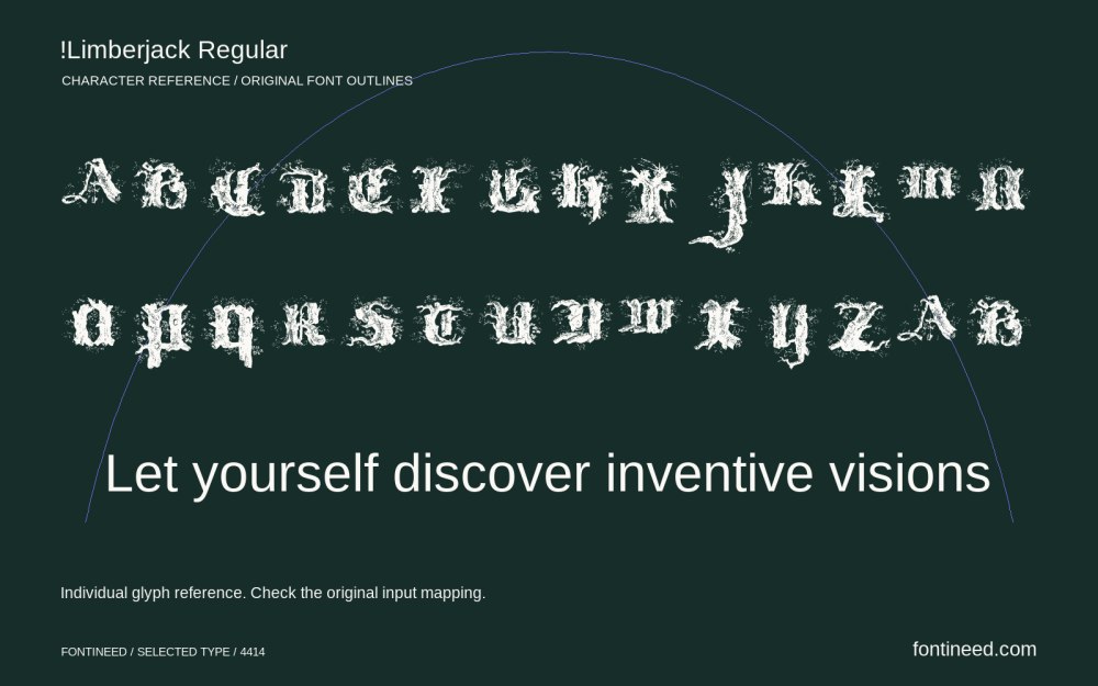
Decorative display letteringView font →
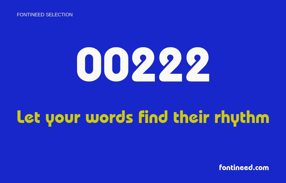
Rounded displayView font →
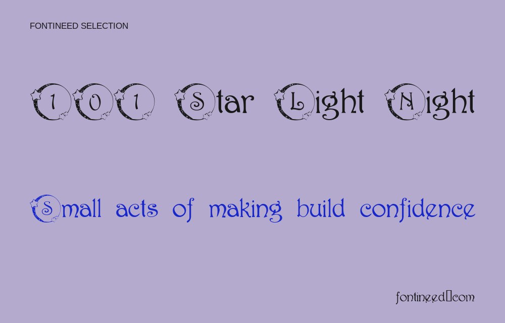
Display letteringView font →

decorative display letteringView font →
More by Ray Larabie
Explore other catalog entries credited to this designer.
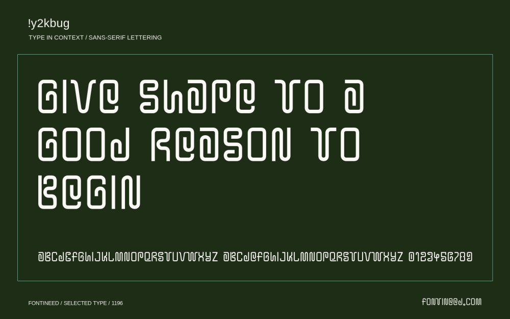
Not classifiedView font →

Not classifiedView font →
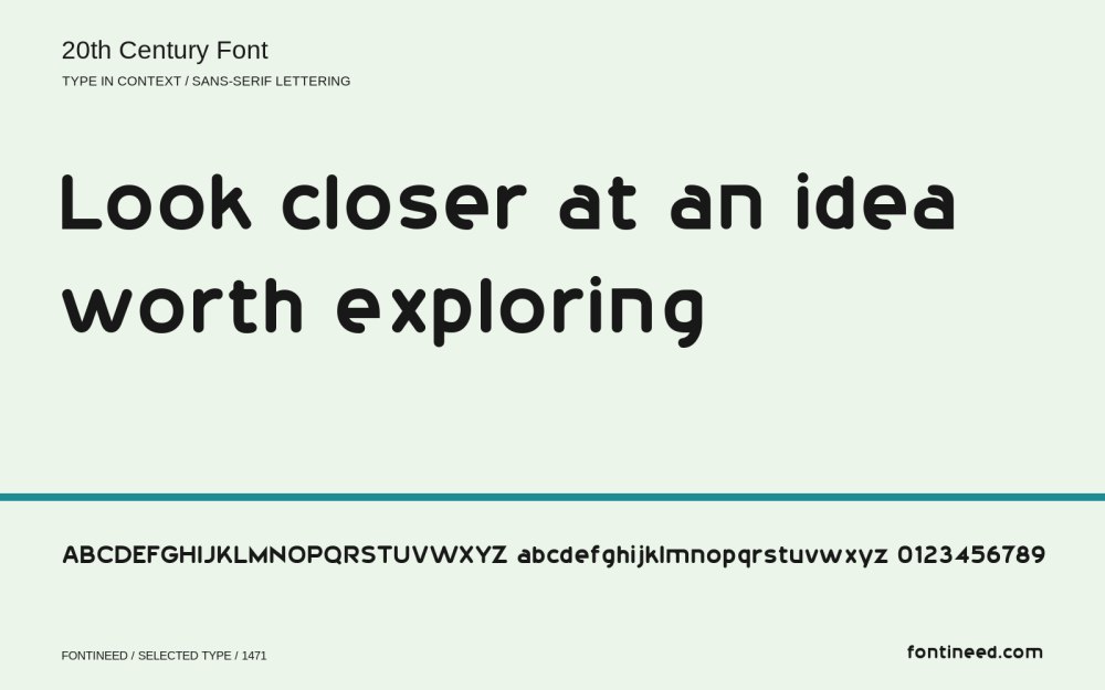
VariousView font →
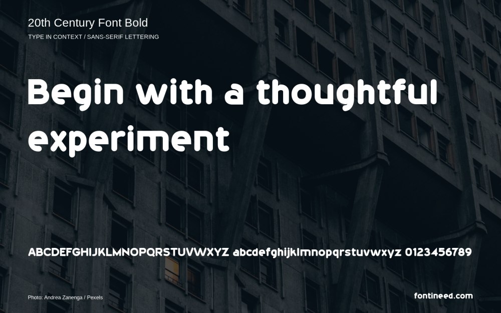
Bold geometric sans serifView font →
Newly Added Fonts
Recently added to the FontIneed catalog.


