Suse
Creator: Rene Bieder
Type Tester
Suse
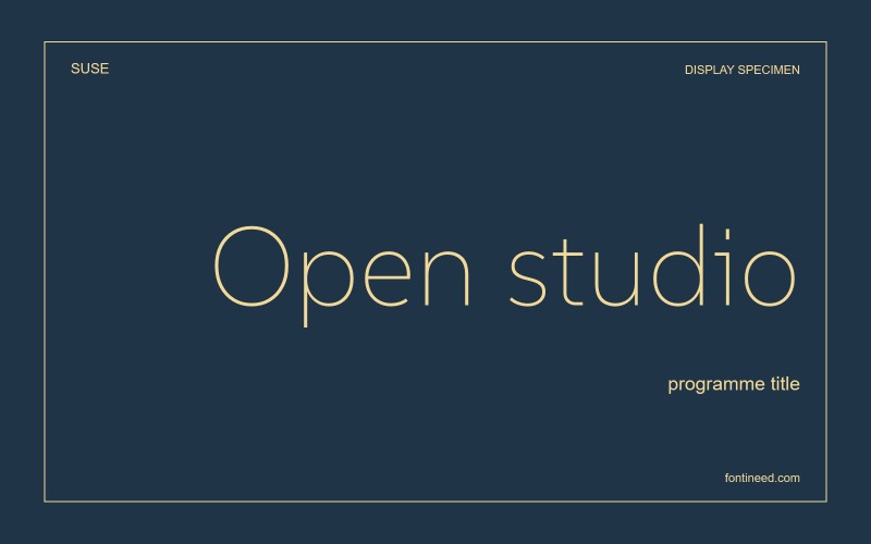
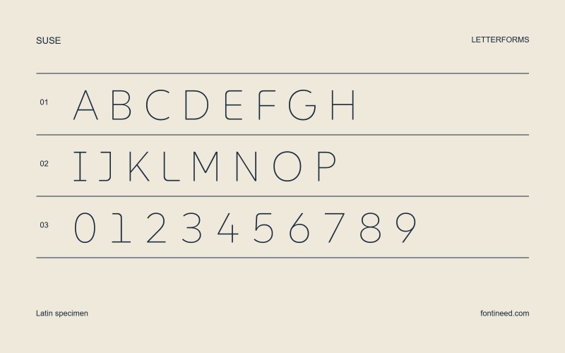
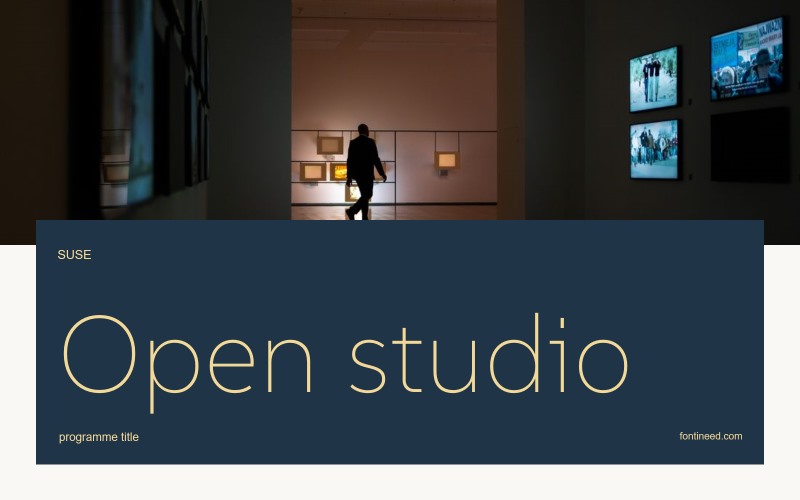
Suse in use
SUSE is most worthwhile to me when a screen has to carry an identity and a great deal of practical text. The open forms leave space inside the letters, and the lighter drawing sets a fairly even colour in a line. I’d look at the variable weights across tabs, headings and short descriptions in an actual interface. At each step, change weight first and size second. It is a way to find the smallest change that still communicates a hierarchy.

Compare sizes
Character sample
A sample of common input positions. Symbol and legacy-encoded files may show other shapes or missing characters.
Download Suse
Check license file. An archive readme may contain installation instructions only; check the creator’s usage terms before use.
Similar Fonts
Related catalog styles; compare the characters and license before choosing.
Newly Added Fonts
Recently added to the FontIneed catalog.


