Strichpunkt Sans
Creator: Strichpunkt Design
Type Tester
Strichpunkt Sans
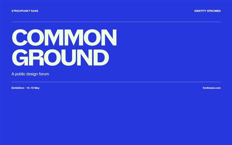
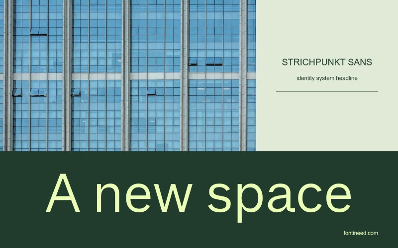
Strichpunkt Sans in use
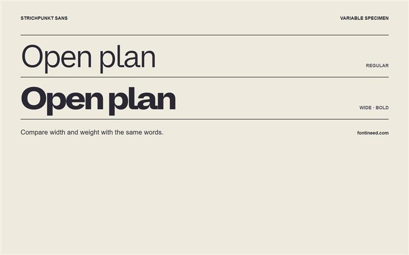
Open the specimen and compare the two settings of “Open plan.” The lighter setting leaves the white space in charge. In the heavier setting, the same phrase becomes a compact graphic object. That change of emphasis is what I’d use in a wayfinding project, with the bold drawing for destinations and a lighter drawing for the information underneath. Keeping both in Strichpunkt Sans lets the lettering change volume while the underlying rhythm still feels related.

Compare sizes
Character sample
A sample of common input positions. Symbol and legacy-encoded files may show other shapes or missing characters.
Download Strichpunkt Sans
Check license file. An archive readme may contain installation instructions only; check the creator’s usage terms before use.
Similar Fonts
Related catalog styles; compare the characters and license before choosing.
Newly Added Fonts
Recently added to the FontIneed catalog.


