Shadower
Creator: Igor Stepanchenko
Type Tester
Shadower
Shadower in use
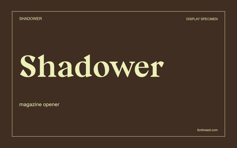
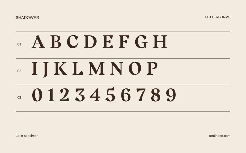
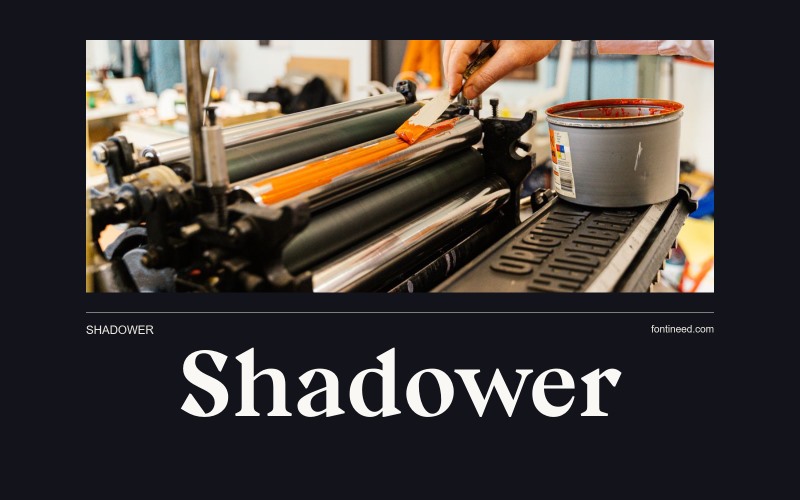
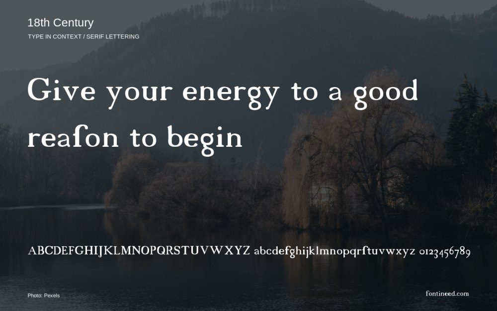
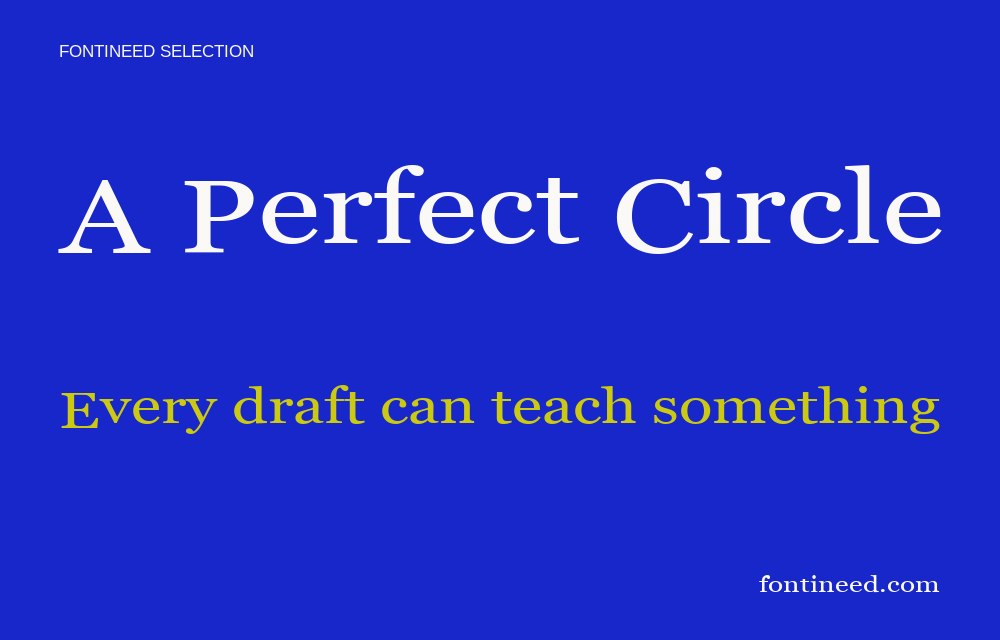
Shadower has the sharp points and small areas of contrast I like to see in a display serif for a dramatic title. The letters give a line a certain ceremony, especially when several broadly drawn capitals appear together. I’d try it on a poster for a chamber concert or on the cover of a short fiction edition. Build the spacing around the hardest letter pair in the title. If that pair has enough air, the smaller details have a better chance of being read.

Compare sizes
Character sample
A sample of common input positions. Symbol and legacy-encoded files may show other shapes or missing characters.
Download Shadower
Check license file. An archive readme may contain installation instructions only; check the creator’s usage terms before use.
Similar Fonts
Related catalog styles; compare the characters and license before choosing.

More by Igor Stepanchenko
Explore other catalog entries credited to this designer.

Newly Added Fonts
Recently added to the FontIneed catalog.


