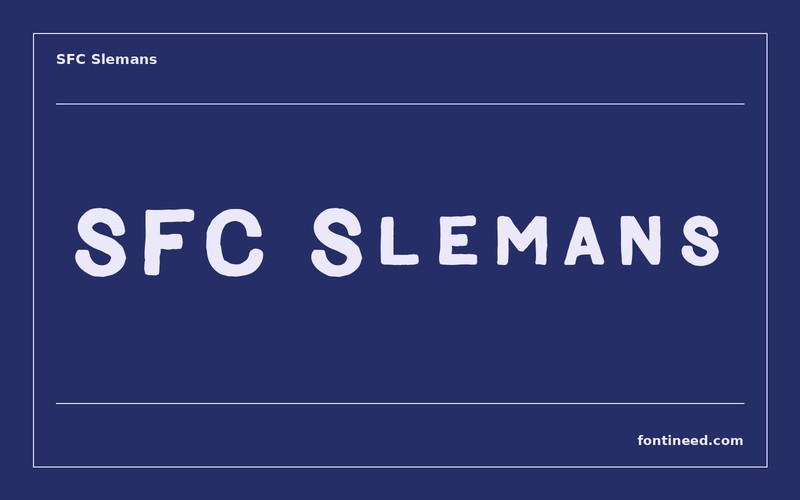
SFC Slemans
Creator: Skilline Fonts Co.
About this font
SFC Slemans in use
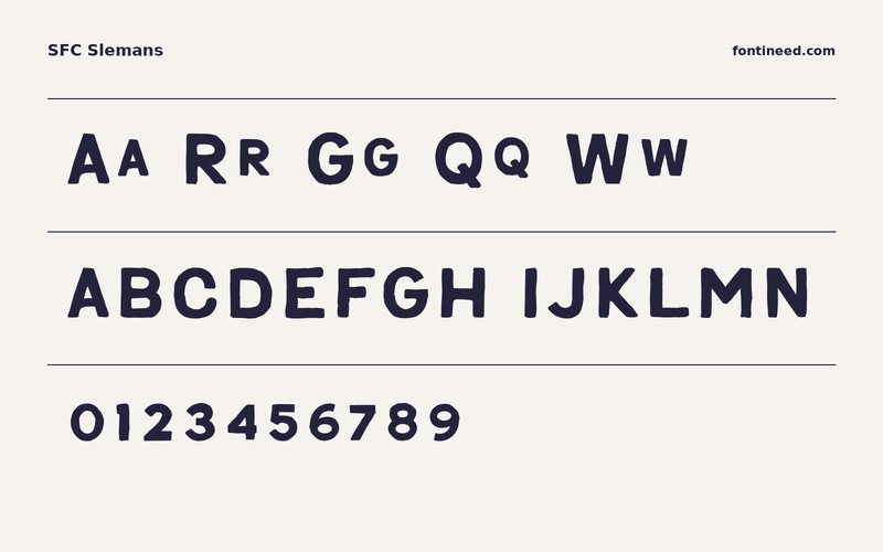
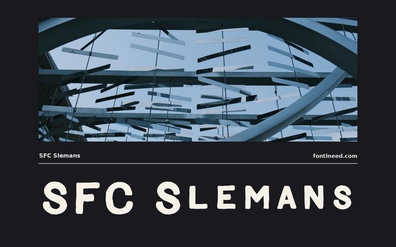
What I’d keep from SFC Slemans is the rhythm of the large rounded letters set against the straight uprights. The line looks soft enough for informal signage while keeping a substantial stroke. I’d compare it in an all-cap name on a narrow packaging panel and as a longer title. A clean background gives those generous shapes a chance to speak.

Download information
Download SFC Slemans
ZIP archive
Similar Fonts
Related catalog styles; compare the characters and license before choosing.

Sans-serif letteringView font →
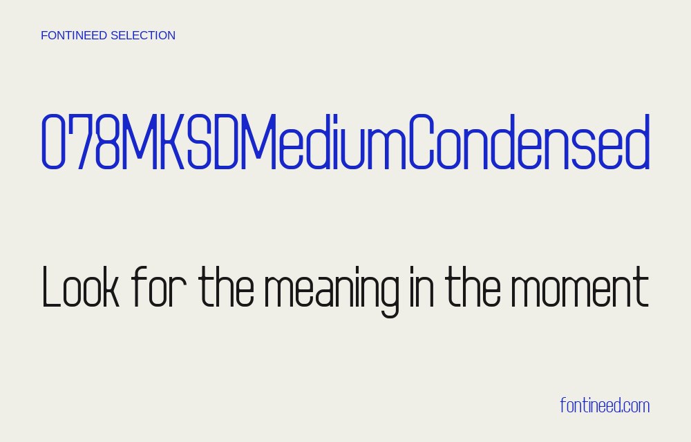
Sans serif letteringView font →
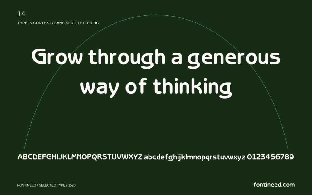
Sans serif letteringView font →
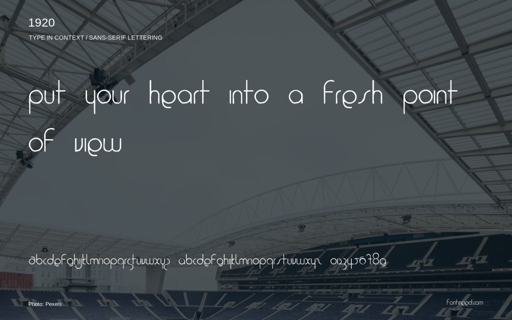
Sans serif letteringView font →
Newly Added Fonts
Recently added to the FontIneed catalog.


