RUDE
Creator: Masha Chuprova
Type Tester
RUDE
RUDE in use
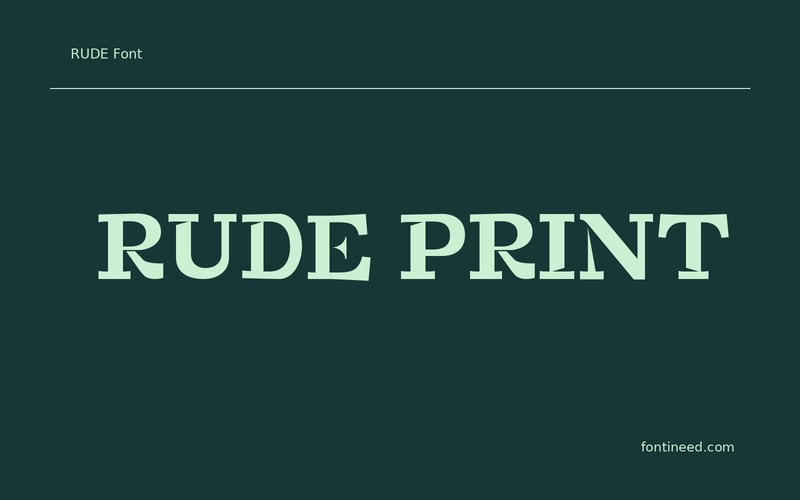
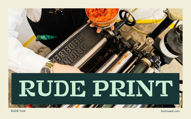
Rude is the kind of lettering I’d trust to sit alone above an illustration. “RUDE PRINT” has two short words that make the strong shapes into a clear block, useful on a sticker or shirt. Check the lines at the actual width of a print area, where the smaller spaces between letters can be as visible as the thick strokes. I’d give a single color room to carry the design before adding a textured edge around the type.
Try putting the press name beside the printed mark on a shipping label. Two short blocks with a calm space between them read better than asking the display line to carry everything. I’d let the shorter words retain the same size across several items. The common serif rhythm can tie together the range without forcing every label to occupy the same width.

Compare sizes
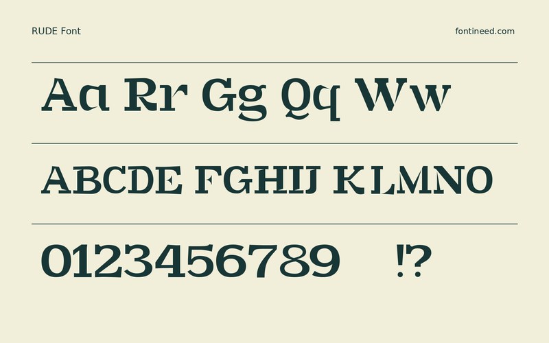
Character sample
A sample of common input positions. Symbol and legacy-encoded files may show other shapes or missing characters.
Download RUDE
Check license file. An archive readme may contain installation instructions only; check the creator’s usage terms before use.
Similar Fonts
Related catalog styles; compare the characters and license before choosing.


Newly Added Fonts
Recently added to the FontIneed catalog.


