Roc Grotesk
Creator: Kostic
Type Tester
Roc Grotesk
Roc Grotesk in use
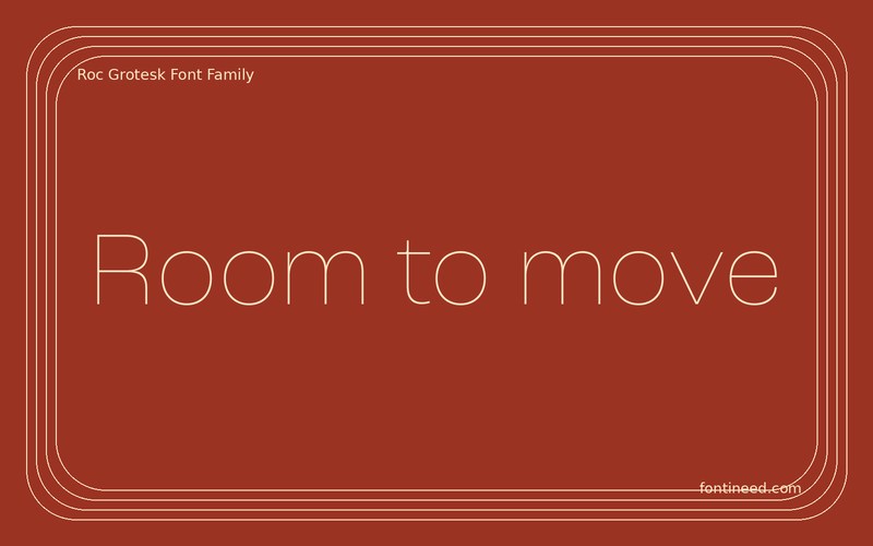
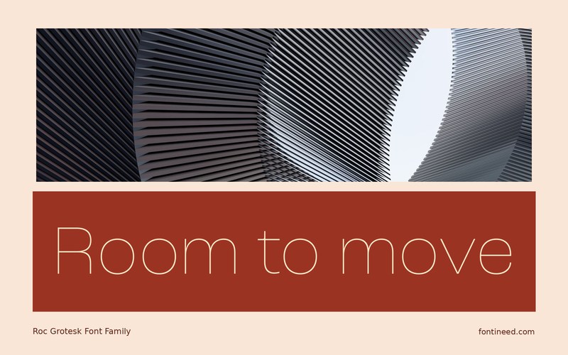
The Thin cut gives Roc Grotesk a quiet way to occupy a visibly large area. “Room to move” would work very differently in the heavier styles, and I’d set those cuts against the same sized image so the comparison is fair. Start with the small use first to see where a stronger cut is necessary. At display scale, its spacious structure can let the words remain legible while preserving enough contrast to leave the photo as the main attraction.
Use the Thin cut where the paper or screen can support it. The contrast between a broad headline and a sturdier narrow caption can make the photograph feel better anchored. Let the smallest important word lead the scale decision on the caption. It can stay comfortably readable even if the title uses a very fine cut.

Compare sizes
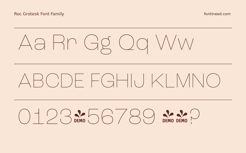
Character sample
A sample of common input positions. Symbol and legacy-encoded files may show other shapes or missing characters.
Download Roc Grotesk
Check license file. An archive readme may contain installation instructions only; check the creator’s usage terms before use.
Similar Fonts
Related catalog styles; compare the characters and license before choosing.
Newly Added Fonts
Recently added to the FontIneed catalog.


