Rische
Creator: Flavortype
Type Tester
Rische
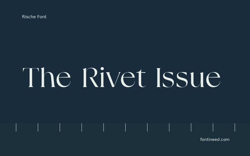
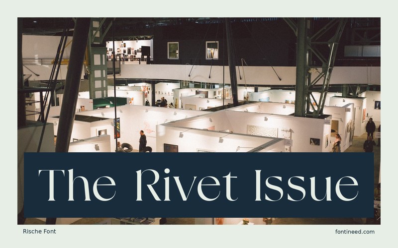
Rische in use
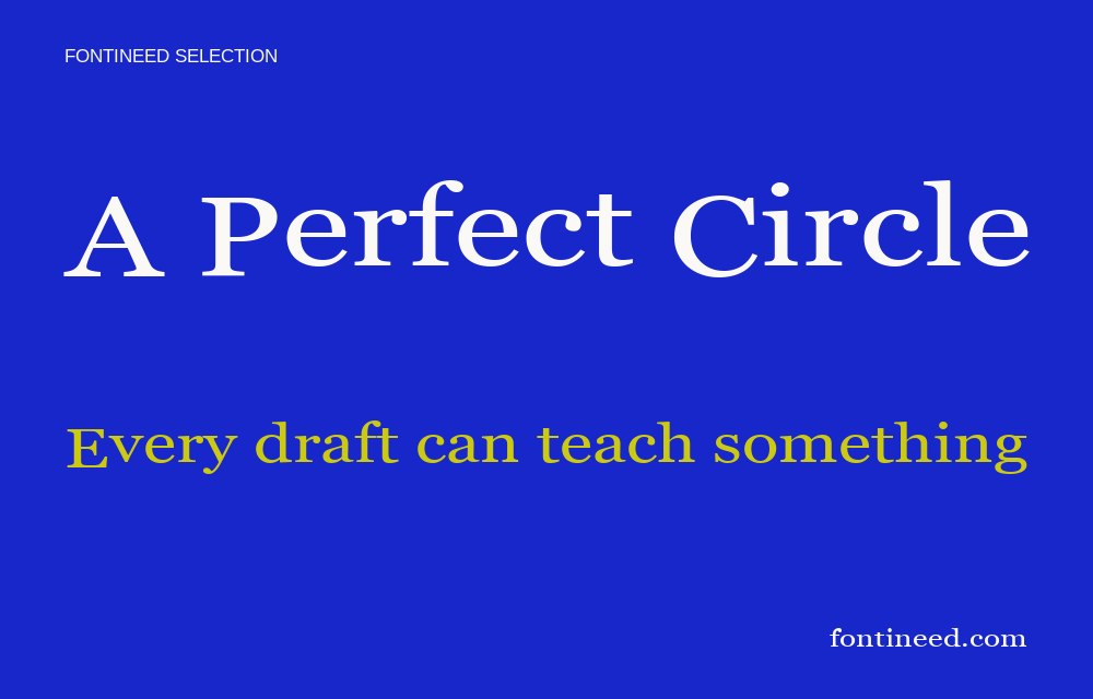
Rische interests me for a short editorial line whose profile is supposed to do some of the visual work. In “The Rivet Issue,” the serif shapes can sit beside a photograph with only one smaller level of type. Before making the heading large, test the publication’s longest likely title. Make space around the fine turns where the line meets a border or image. You should still be able to recognize the title when the rest of the layout gets cropped.
On an editorial page, test the main heading with one photograph and a long deck. The type gains character when the surrounding design leaves it something of its own to do. For the issue’s shortest headline, keep an extra measure of empty space rather than enlarging it until it resembles another title. The serif can sound confident at one consistent editorial scale.

Compare sizes
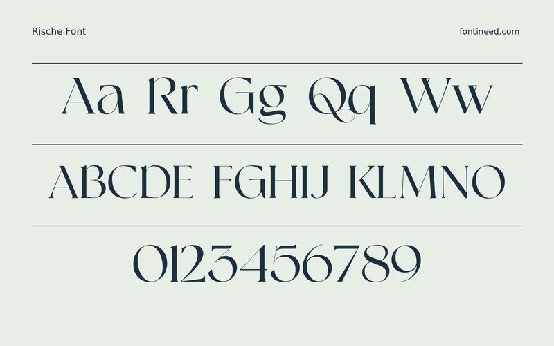
Character sample
A sample of common input positions. Symbol and legacy-encoded files may show other shapes or missing characters.
Download Rische
Check license file. An archive readme may contain installation instructions only; check the creator’s usage terms before use.
Similar Fonts
Related catalog styles; compare the characters and license before choosing.


Newly Added Fonts
Recently added to the FontIneed catalog.


