PP Valve
Creator: Pangram Pangram
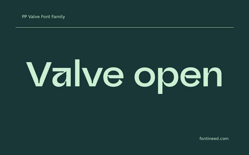
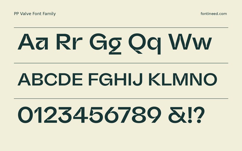

PP Valve in use
PP Valve Plain is a face I’d try on a panel where small practical labels are doing real work. The Plain Medium sample could carry “Valve open” with a level rhythm beside a switch or status value. In that setting, the important thing is what the lettering lets a reader tell apart. Proof the strongest status, the longest control, and the smallest bit of supporting text together. Then use the distinctive styles where the interface can afford a characterful heading.
I’d measure the legibility of a small control against several other ones of different lengths. Set the actual active state in context rather than making every label as prominent as the main heading. A good control panel test includes a line of warnings. The relative weight should support how quickly that information needs to be read in an ordinary working session.

Download PP Valve
ZIP archive
Similar Fonts
Related catalog styles; compare the characters and license before choosing.
More by Pangram Pangram
Explore other catalog entries credited to this designer.


Newly Added Fonts
Recently added to the FontIneed catalog.


