PolySans
Creator: Gradient
Type Tester
PolySans
PolySans in use
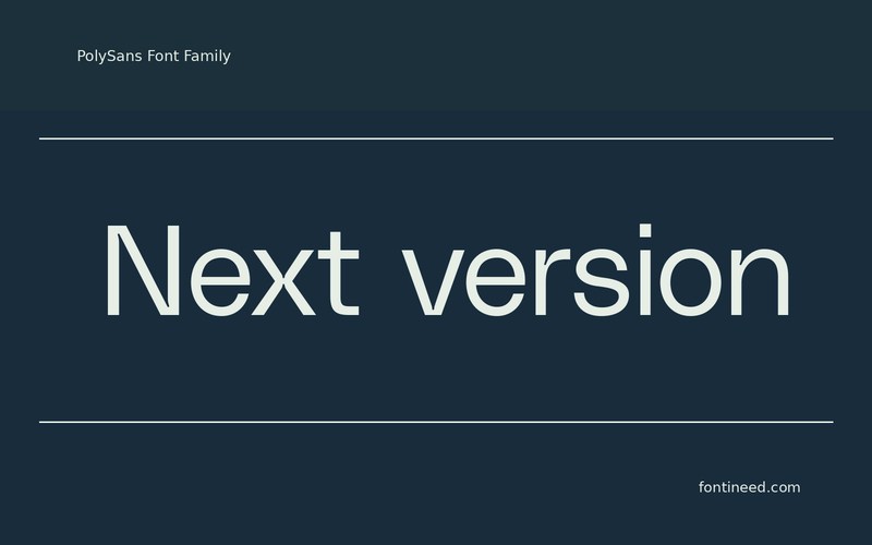
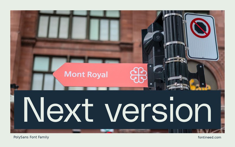
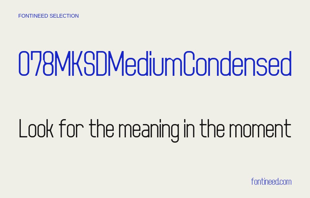
PolySans interests me when a product needs short labels with a strong visual starting point. The slim cut gives room for a larger heading on a compact panel, where “Next version” can sit near an update number without forcing either line to look tiny.
If the product uses a numerical version or price, put that next to the heading in the first test. The visual weight on both sides of the panel can guide the final spacing. Pair the heading with two unusually long labels from the real project. Decide what should wrap and what should remain on one line. In a useful layout, I want the related items to read together even when their wording has very different lengths. The type gives you a disciplined rhythm for making those small spacing decisions.

Compare sizes
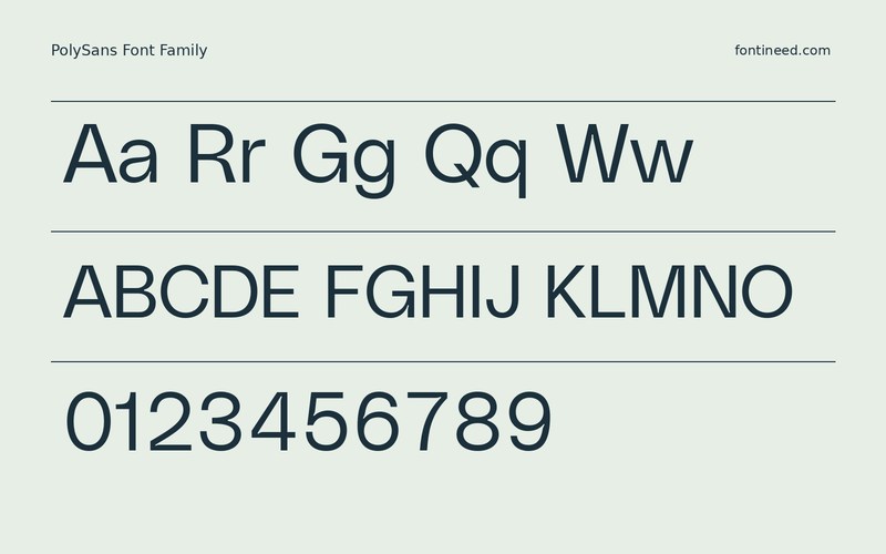
Character sample
A sample of common input positions. Symbol and legacy-encoded files may show other shapes or missing characters.
Download PolySans
Check license file. An archive readme may contain installation instructions only; check the creator’s usage terms before use.
Similar Fonts
Related catalog styles; compare the characters and license before choosing.

Newly Added Fonts
Recently added to the FontIneed catalog.


