Pliant
Creator: Jona Saucedo · Non Foundry
Type Tester
Pliant
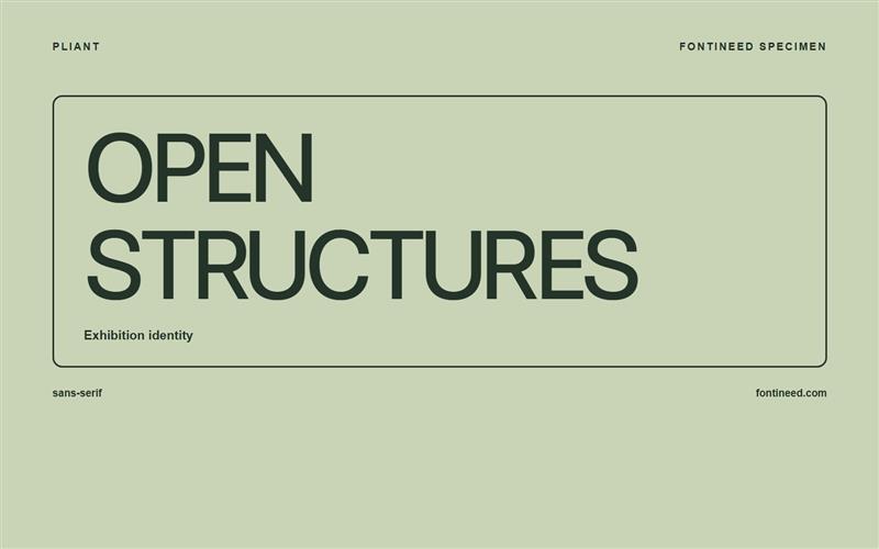
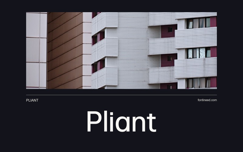
Pliant in use
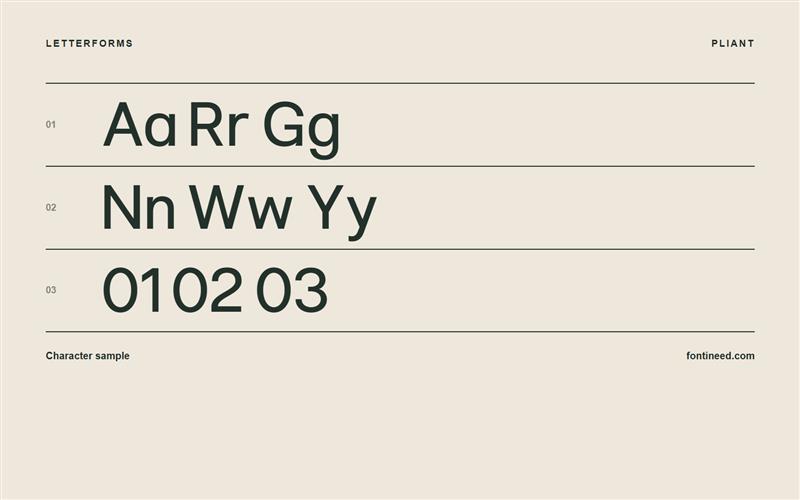
Comparing Aa, Rr and Gg is the useful way into Pliant. The uppercase gives a line a steady framework, and the lowercase introduces enough variation to carry a real title with names, initials and figures. I’d choose it for an editorial layout where I want the grid to feel ordered and the wording to keep its natural rhythm. Give it a two-line headline before judging it from a logo alone. That’s where the relationship between the forms starts to pay off.

Compare sizes
Character sample
A sample of common input positions. Symbol and legacy-encoded files may show other shapes or missing characters.
Download Pliant
Check license file. An archive readme may contain installation instructions only; check the creator’s usage terms before use.
Similar Fonts
Related catalog styles; compare the characters and license before choosing.
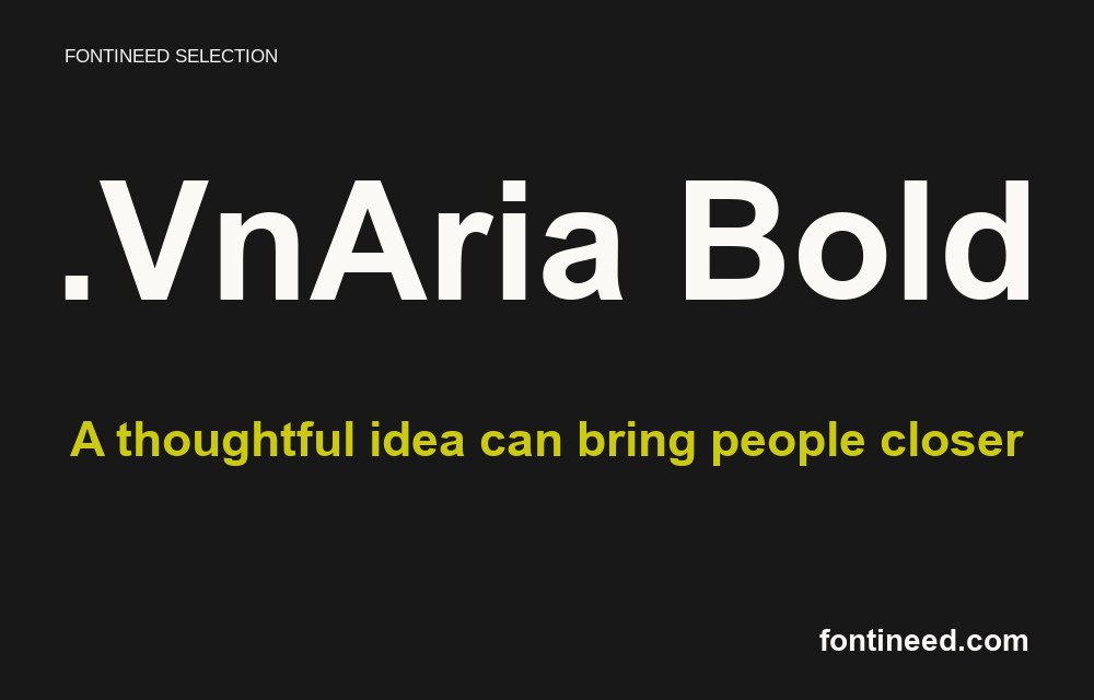
Newly Added Fonts
Recently added to the FontIneed catalog.


