Nintendo
Creator: High-Logic
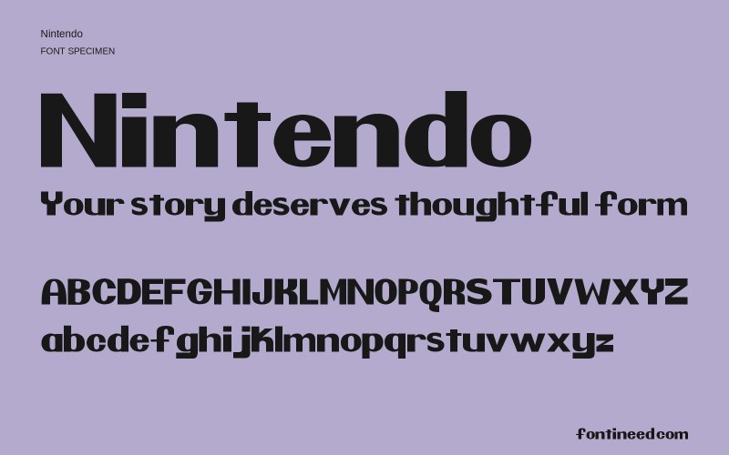
Nintendo in use
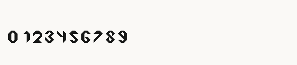
Nintendo uses rounded sans serif shapes and an even, substantial stroke weight. The visible alphabet is suited to testing short labels or a compact display heading, but individual forms should be checked in the actual wording. Keep the internal spaces clear when reducing its size. The archive's brand-related name does not establish an official relationship or permission to reproduce associated company graphics.

Compare sizes
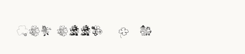
Character sample
A sample of common input positions. Symbol and legacy-encoded files may show other shapes or missing characters.
Download Nintendo
Check license file. An archive readme may contain installation instructions only; check the creator’s usage terms before use.
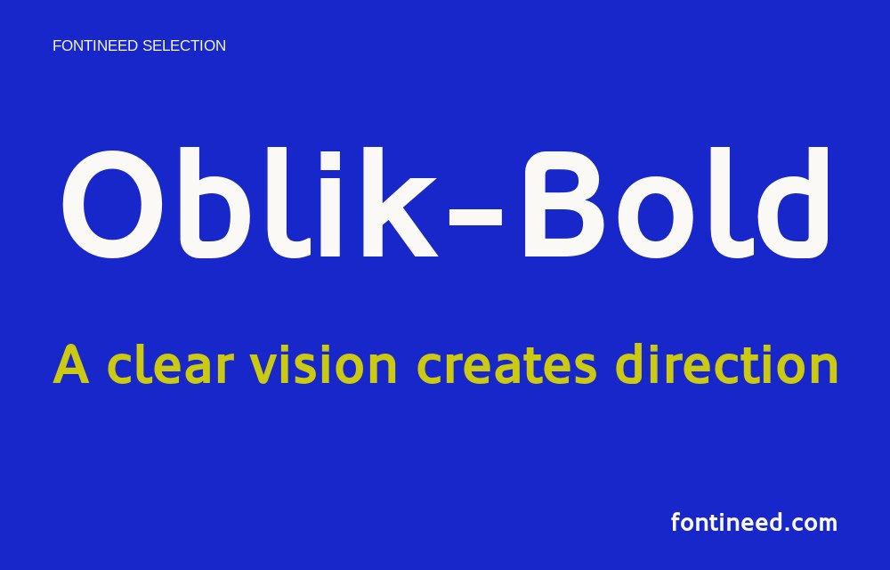
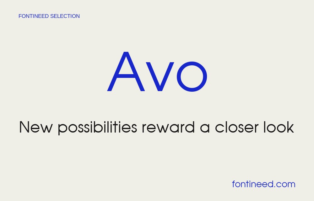
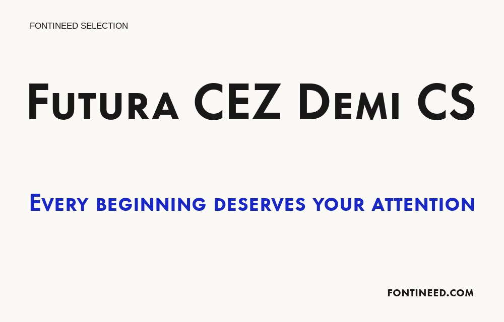
Similar Fonts
Related visual styles; check each font’s characters and license.
More by High-Logic
Explore other catalog entries credited to this designer.
Newly Added Fonts
Recently added to the FontIneed catalog.