Luxury Display
Creator: andikastudio
Luxury Display in use
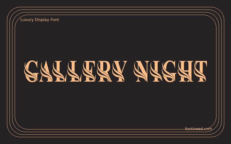
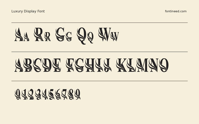
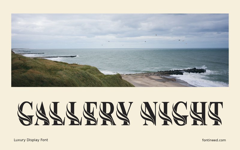
LUXURY reads as a display wordmark with a specific atmosphere. I’d try “GALLERY NIGHT” on a narrow invitation or an event poster, setting the title large enough to see the relationship between thick and fine details. Luxurious material can make that relationship harder to read, especially with reflective ink, so a close proof and a distance proof both matter. Put the date behind one steady visual anchor and let the headline have its own generous clearance.
Compare the headline with a narrow line of ordinary written instructions. That contrast can give the display letterforms a distinct purpose when the printed piece is handled close up. Leave open space at the end of an unusually narrow or wide word. See whether the headline feels complete before filling that space with decorative marks.

Download Luxury Display
ZIP archive
Similar Fonts
Related catalog styles; compare the characters and license before choosing.
More by andikastudio
Explore other catalog entries credited to this designer.


Newly Added Fonts
Recently added to the FontIneed catalog.


