Delight
Creator: RajeshRajput
Type Tester
Delight
Delight in use
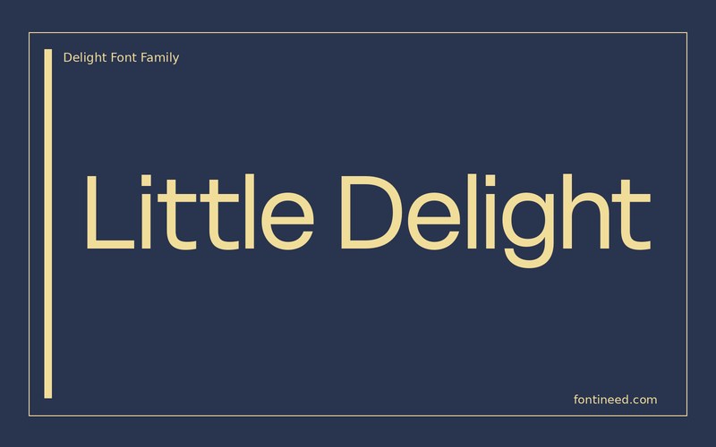
Delight should be looked at first in a line that has a few small changes in rhythm. “Little Delight” has taller forms and quieter letters in both words, useful when a fashion label can carry only one large line. I’d compare the printed name at a large and small scale before giving it more decoration. Preserve an open field at the smallest sizes. The drawing deserves enough room that the brand can feel light without losing clarity.
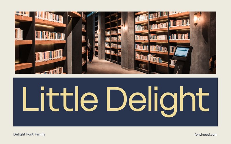
Put the title directly into an image crop and then proof it without the image. The result should have enough of its own shape to feel recognizable either way. Try a long name in a single display color and use everyday lettering for the rest. The serif voice becomes clearer once it has one role to perform.

Compare sizes
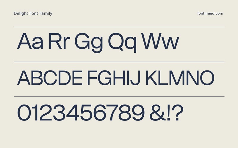
Character sample
A sample of common input positions. Symbol and legacy-encoded files may show other shapes or missing characters.
Download Delight
Check license file. An archive readme may contain installation instructions only; check the creator’s usage terms before use.
Similar Fonts
Related catalog styles; compare the characters and license before choosing.



More by RajeshRajput
Explore other catalog entries credited to this designer.


Newly Added Fonts
Recently added to the FontIneed catalog.


