Beautiful Bloom
Creator: Mats-Peter Forss
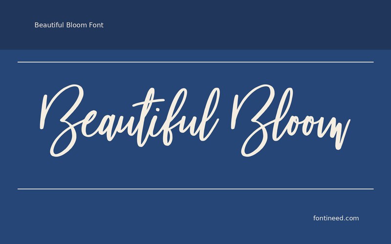
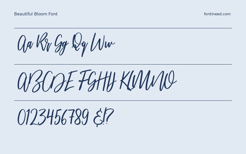
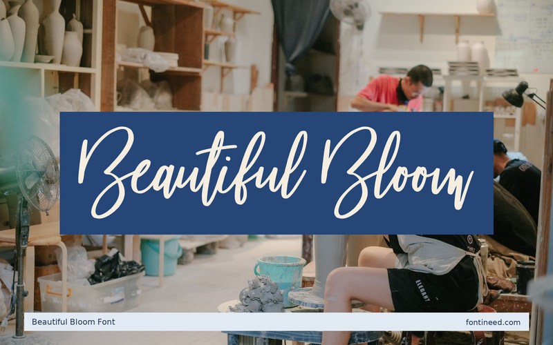
Beautiful Bloom in use
Beautiful Bloom can make the title of a card look composed around a handwritten inscription. I’d try “Beautiful Bloom” at the size of a real welcome card and leave enough room below the words for the stems to finish. A clean printed line can carry the venue or contents. That keeps the reader from encountering every message in the same flowing style. Use the longest pair of names in your test, especially if the arrangement will be repeated with different guests.
I’d check the narrow digital invite and the wide paper version with the same wording. A graceful combination of initials can support both when the lines are allowed different margins. If the wording includes a long surname, use it to test where the lowest letters finish. Keep the next printed line far enough away to let the signature feel complete.

Download Beautiful Bloom
ZIP archive
Similar Fonts
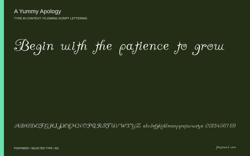
Related catalog styles; compare the characters and license before choosing.


More by Mats-Peter Forss
Explore other catalog entries credited to this designer.


Newly Added Fonts
Recently added to the FontIneed catalog.


