Roggenkamp
Creator: Walther Roggenkamp
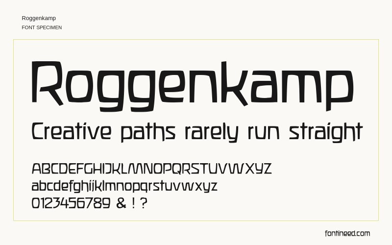
Roggenkamp in use
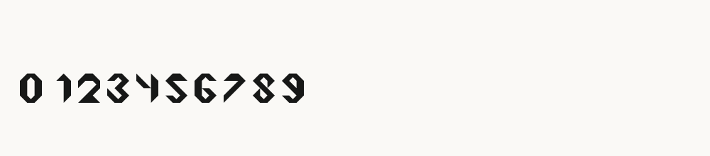
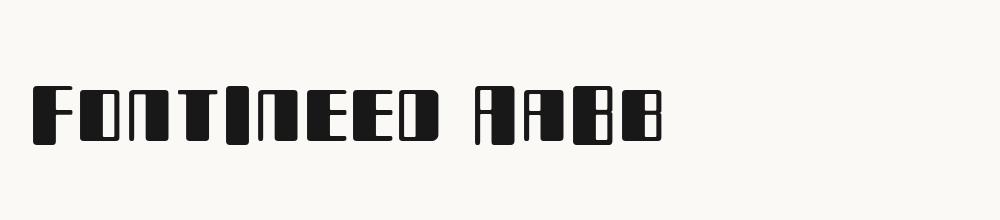
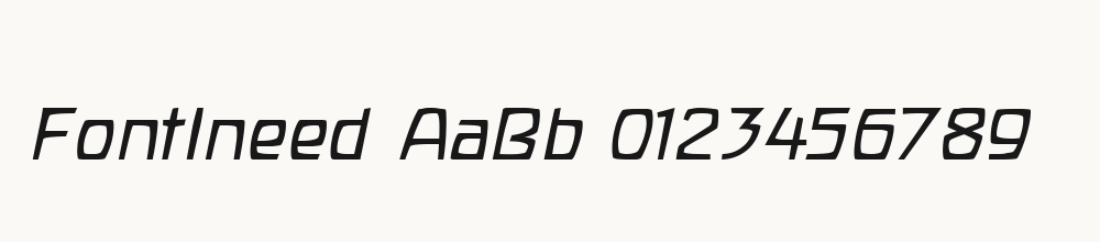
Roggenkamp has thin, irregularly squared strokes and slightly uneven proportions that give familiar letters a hand-constructed character. It is an option for short experimental headings or informal graphic labels. The numeral row shares the same angular rhythm, making it worth testing for a date or chapter number. Keep enough size for the narrow shapes and avoid over-tightening repeated upright strokes.

Compare sizes
Character sample
A sample of common input positions. Symbol and legacy-encoded files may show other shapes or missing characters.
Download Roggenkamp
Check license file. An archive readme may contain installation instructions only; check the creator’s usage terms before use.
Similar Fonts
Related visual styles; check each font’s characters and license.


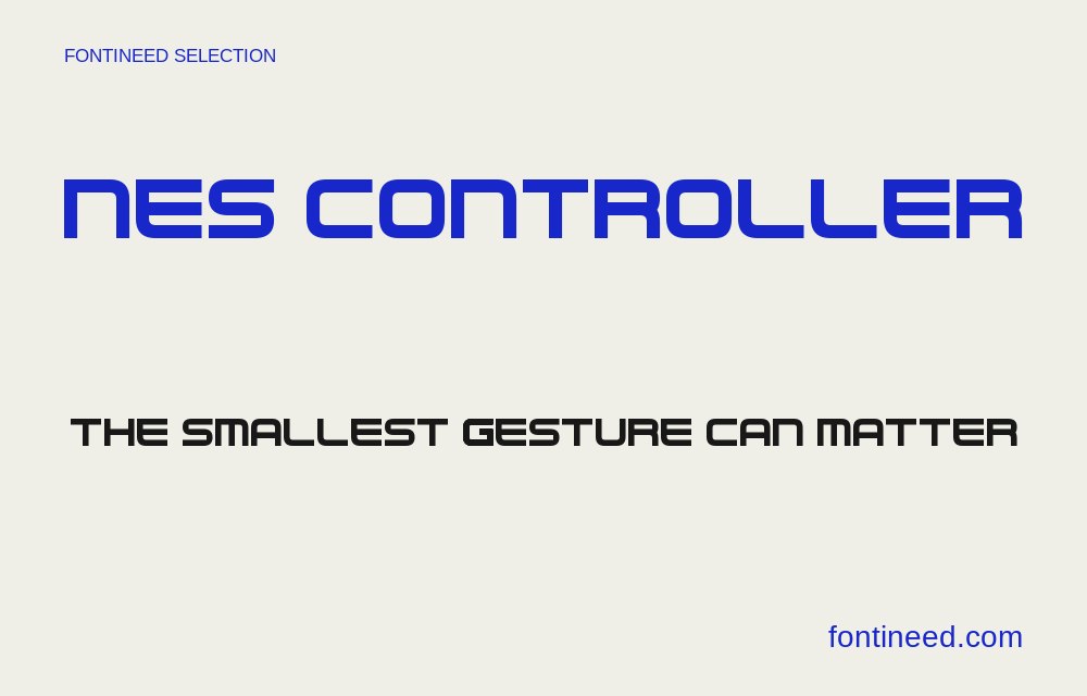
More by Walther Roggenkamp
Explore other catalog entries credited to this designer.
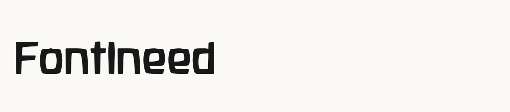
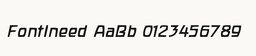
Newly Added Fonts
Recently added to the FontIneed catalog.