Niagara Solid
Creator: Tobias Frere-Jones
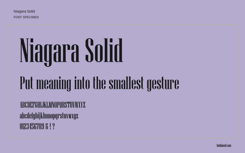
Niagara Solid in use
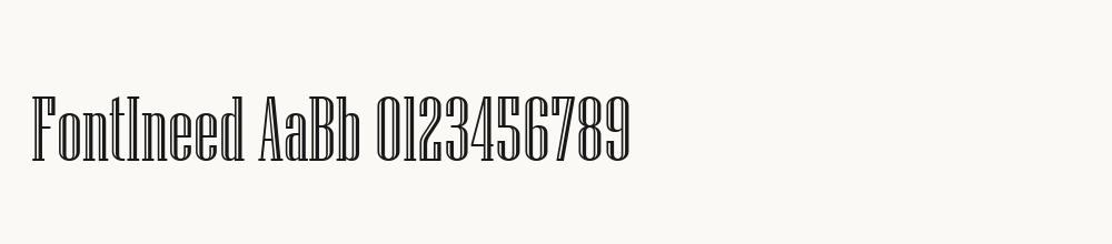
Niagara Solid combines very narrow proportions with strong vertical strokes and small serif details. Its tall, dark texture is suited to a compact poster heading where height is available but width is limited. Keep the phrase brief and leave space between lines. Examine repeated vertical letters at the final size, since a large preview can hide crowding that becomes obvious in a small mobile image or printed label.

Compare sizes
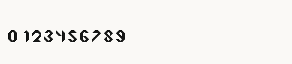
Character sample
A sample of common input positions. Symbol and legacy-encoded files may show other shapes or missing characters.
Download Niagara Solid
Check license file. An archive readme may contain installation instructions only; check the creator’s usage terms before use.
Similar Fonts
Related visual styles; check each font’s characters and license.

More by Tobias Frere-Jones
Explore other catalog entries credited to this designer.
Newly Added Fonts
Recently added to the FontIneed catalog.